Enough / Open-source brand resources
Room for
what matters.
Enough is an open-source project for useful, understandable tools. This shared identity connects Enough, Enough Tools, and EnoughUI.
 Useful structure. Open space.
01 / Brand idea
Enough to build on.
Enough is a positive choice: useful tools, clear decisions, and room to do your work. The design gives that idea a practical shape.
01 / Purpose
Give the task space. Remove visual clutter. Let people see what matters and what comes next.
02 / Character
Plain language, readable type, deliberate structure. A useful tool should feel understandable.
03 / Platform
A modular workspace deployed into your organization’s own cloud account, with the tools you choose.

Parent brandOur shared project name and point of view. Use for communication about Enough and the wider family.

Cloud platformOne home for shared files, identity, and optional tools. Modules use descriptive names: Files, Docs, Sheets, Forms.

Interface systemThe React and Astro component library. Its existing mark, colors, type, and square geometry anchor this identity.
Use Enough, Enough Tools, and EnoughUI in writing. Lowercase lettering belongs to the visual wordmarks. “Cloud platform” is a descriptor, rather than an additional brand name.
02 / Identity
A familiar signature.
The square “e.” mark continues EnoughUI’s existing identity. The same wordmark and lighter descriptors keep the family together.
Keep at least half the mark’s height clear on every side. The SVG canvas contains the artwork; add clear space in the layout.
Full lockups: mark height ≥32 px or 10 mm. Standalone mark: ≥24 px or 8 mm. Use the browser favicon export for 16 px.
Use supplied artwork. Preserve proportions, letter spacing, descriptor weight, and the square tile. Keep effects outside the logo.

SVGs are outlined, so their appearance stays consistent without installed fonts. Ink is the default; reverse is for dark fields. The blue logo is available for occasional brand emphasis.
03 / Color
Ink, paper, a signal.
The core palette comes directly from EnoughUI. Give neutral surfaces most of the space. Blue directs attention to a choice, an action, or a point of emphasis.
Ink on Paper
Default reading pair. Strong contrast for body copy, tables, and navigation.
White on Blue
Suitable for action labels. Use the lighter Blue on Ink token for links on dark fields.
Muted on Paper: . Blue on Ink: . Ratios use WCAG relative luminance; 4.5:1 is the minimum for normal text. Success and warning colors describe states. Hairline and the line-soft token are for structure, rather than body text.
04 / Type & structure
Clear type. Useful structure.
Space Grotesk does the work. Libre Caslon Text gives important ideas room to breathe. Both are proportional, including numbers, labels, and code treatments.
Libre Caslon Text / 400
what matters.
Headlines · editorial moments · statements
Keep regular weight and natural sentence case.
Space Grotesk / 400–650
Your cloud.
Wordmarks · body · interface · metadata
Clear hierarchy through size, spacing, and weight.
Square geometry. Zero corner radius. One-pixel rules. Small square markers. Use a 4 px spacing unit and 8, 12, 16, 24, 32, 48, 64 px steps.
Blue offsets add a little emphasis.
Quiet depth and motion. Use a 5 px blue offset for selected graphic moments. Keep interface depth subtle. Brief functional fades only; honor reduced motion.
Bundled fonts work offline and include their official licenses. Keep the compatibility token --font-mono mapped to --font-sans. Do not introduce monospace typography.
05 / Words
Say what helps.
Calm, direct, and quietly optimistic. Explain the task, the value, and the next step with specific words people can use.
Enough / Parent line
Room for
what matters.
Useful tools. Space to do your work.
Enough Tools / Platform line
Your tools.
Your cloud.
Your organization. Your deployment.
“Upload a file.” “Choose your tools.” “Deploy your workspace.” Name the action and its result.
Give useful context. Keep buttons short. When something fails, explain how to continue.
Make ownership and modularity clear. Base feature claims on the current platform and its enabled tools.
Enough Tools is a modular workspace for your organization’s files and tools, deployed into your own Cloudflare account.
Start with shared files. Choose Docs, Sheets, or Forms at deployment.
Explore the tools · Read the deployment guide · Upload a file
Empty state: “Your workspace starts here. Upload a file or create one with an enabled tool.”
Error: “We couldn’t upload this file. Check your connection and try again.”
Current scope: Docs and Sheets create and preview files; editing, formulas, and live collaboration remain future work. Workspace members currently share read and write access. Keep descriptions accurate for the tools available in each deployment. See the usage notes for naming and attribution.
06 / In use
One language, many surfaces.
From a workspace header to a launch card, the same signature, proportions, and quiet structure make each touchpoint feel related.
Illustrative workspace / Brand application
FilesAppsPrivate workspaceYour organization. Your deployment.
One home for your team’s files.
Keep files together. Open them with the tools you choose. Your workspace lives in your organization’s cloud account.
 Files
Files Docs
Docs Sheets
 Forms
Forms| Name | Tool | Location |
|---|---|---|
| Project overview | Docs preview | Team files |
| Project budget | Sheets preview | Team files |
| Team feedback | Forms | Forms module |
Illustrative brand application. Available tools depend on the deployment. On respondent pages, the publisher’s identity stays primary; Enough Tools appears as product attribution.
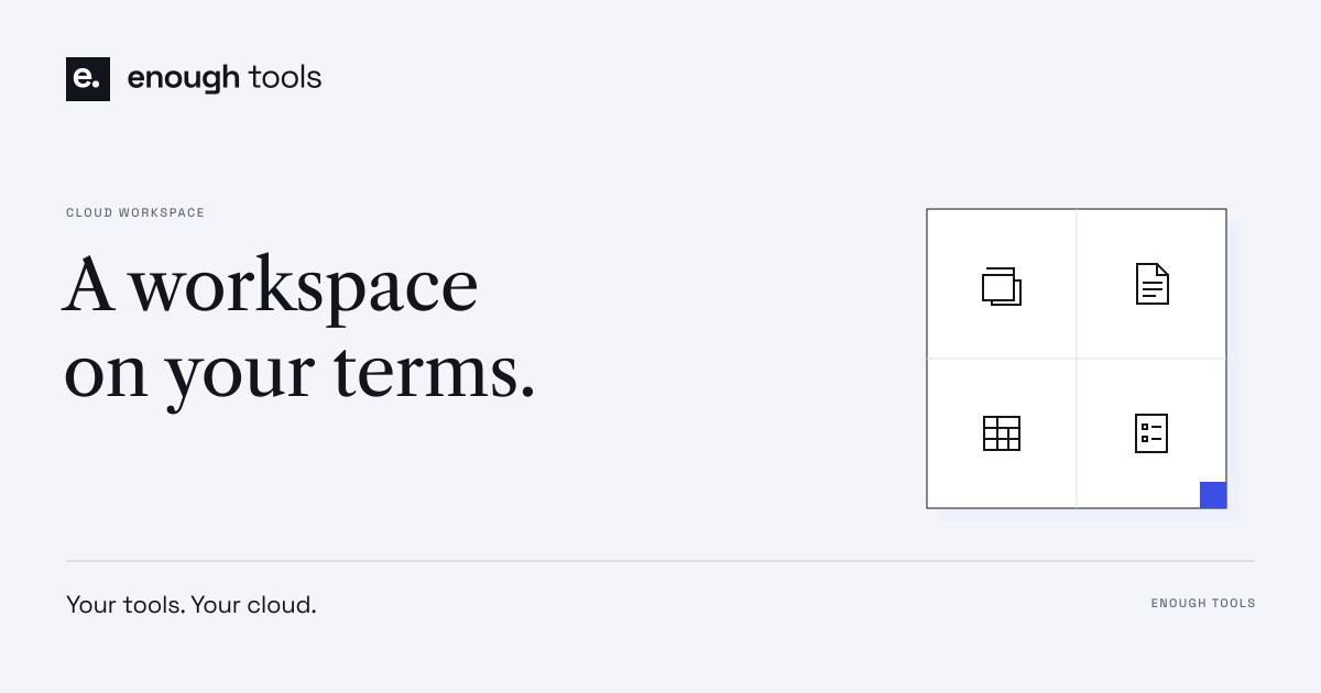
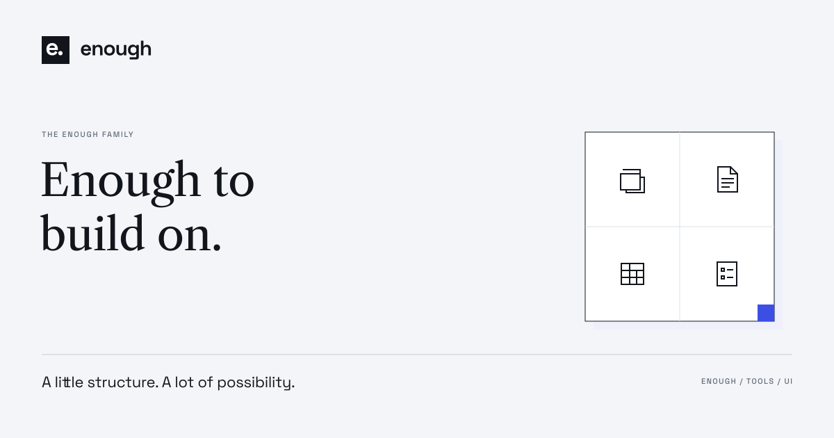
Room for what matters.
Keep everyday materials simple: a readable name, a small wordmark, one contact line, and plenty of white space.
Open the editable email signature ↗Download the 16:9 presentation cover ↓
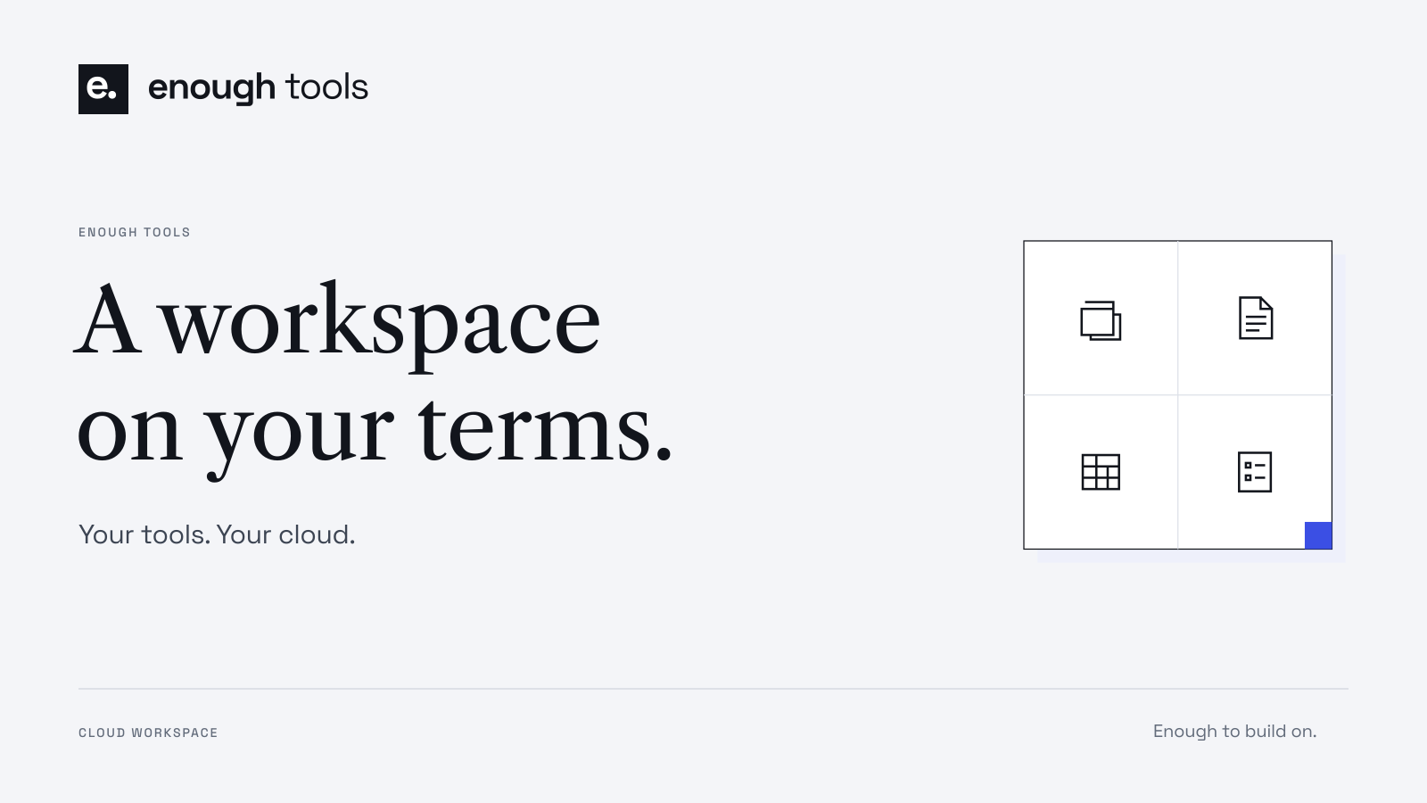
07 / Downloads
Ready to make yours.
Use these resources in project contributions, documentation, presentations, and articles. Download the complete pack or choose the artwork you need.
Brand pack / Version 1.0
Download all ↓A shareable visual guide to the identity and its use.
Primary outlined vector lockup. Reverse and blue variants are in the pack.
The shared parent signature, built from the existing EnoughUI identity.
The component library’s family lockup.

The shared mark plus Files, Docs, Sheets, and Forms module icons.
EnoughUI colors, proportional fonts, spacing, and geometry.
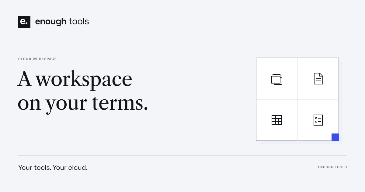
1200 × 630 outlined artwork, with PNG exports included.
A 16:9 title surface for Enough Tools.
08 / Use & contribute
Made to be shared.
Enough grows through contributions. Use the identity to help people recognize the project and the tools built around it.
Use the resources
Download the supplied artwork for documentation, articles, presentations, and project contributions. Keep the logo’s proportions and clear space. Use the written names Enough, Enough Tools, and EnoughUI.
The project materials are available under the MIT license. The bundled fonts carry their own SIL Open Font License notices. Keep the relevant notices when redistributing files.
Build with EnoughUI
Explore the React and Astro components, use the shared design tokens, and contribute improvements to the interface system.
Explore the component catalog
View EnoughUI on GitHub
Read the contribution guide